Behind the Scenes of "THE FALLEN"
Close up of Michelle as a Fallen Angel.

Your Custom Text Here

Close up of Michelle as a Fallen Angel.

Rembrandt, Brooke Shaden, the Pre-Raphaelite Era, and early 1400th century Renaissance paintings.
The five defining personality traits of this character are
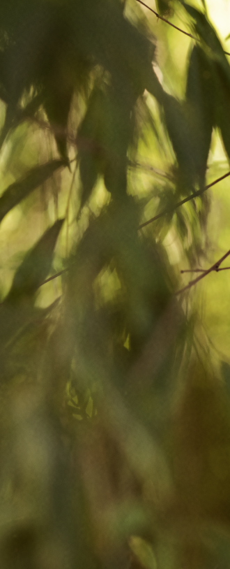
The daughter of a well-known Italian aristocrat indulges in a romantic walk along the creeks of her villa where she weaves her way through a forest of willow trees.
My mother discovered Emily at work and since day one of meeting her she insisted that I photograph Emily in one of my projects. After four months we finally did.
I’d like to give a shout out to Emily and say thank you for creating such an enjoyable work experience and for bringing this project to life with me.
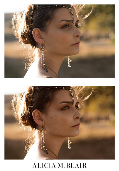
The posing inspiration for this project came from the body language found in the paintings of the Renaissance. It’s important to note that the people who commissioned portraits in the Renaissance were the wealthy nobility, not peasants, and due to the design of the era’s wardrobe, a sitter’s body language was very rigid.
For this project, it was important to me to captured some of that rigidity; however, my story takes place during a private moment where this young poet is escaping the confines of her life in high society. Although she is a member of nobility, she is also a free spirit who enjoys getting her hands dirty and expressing her ideas on paper.
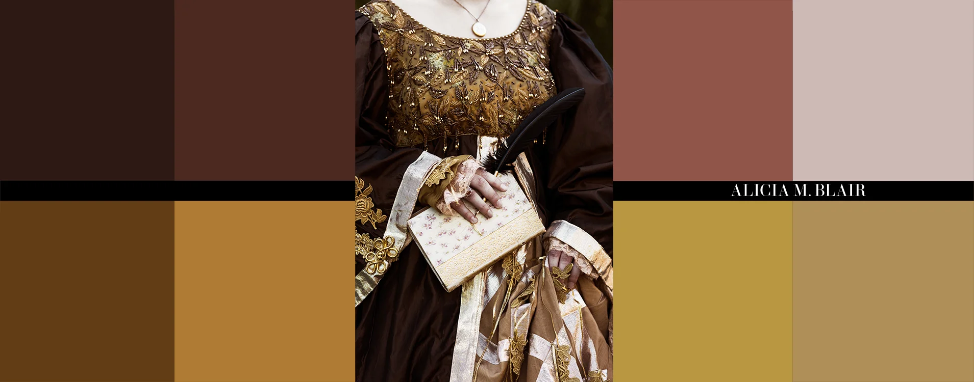
My mother found this dress at a theater sale where the company was selling old costumes. There was a bit of basic maintenance to do, but overall the dress was well preserved. I especially loved the warm tones of the dress with its gold and brown hues that matched perfectly with the model's hazel eyes and warm skin tone.
The jewelry for this project had to complement the status and grandeur of the dress as well as the time period. I opted for simple, antiquated designs with translucent earth tone stones and pearls. I wanted my model to be adorned with a bit of sparkle that would be appropriate for her age.


Jess working her magic.
Two Goals:
1.) Emphasis on my model’s natural beauty, allowing it to speak for itself.
+
2.) Stay close to the aesthetic of the time with very little to no make up
=
Simplicity and elegance
My color palette for this project was based on earth tones, and therefore, the make-up had to follow suit. I insisted on using brown and gold tone make up to give the model a less dramatic appearance and a more natural, youthful glow. It was equally important to me that we keep her freckles rather than masking them out with layers of foundation and powder.
In my mind this project is based not in northern California but in the romantic, warm Italian countryside. I decided on creating a world of rich yellows, saturated greens, deep browns, and small hints of rosy pinks.

As is common for me, the location for this shoot proved to be a bit of a challenge. Because so many of my projects are based on characters from different time periods, finding locations without all the electricity and contemporary buildings can be hard to find. As much as I would have loved to shoot in a beautiful antiquated Italian villa, I choose to shoot this project by a park close to my parents’ house. The location provided me with a very simple backdrop that allowed me to move around and play with the framing and composition of my subject.
The project was shot with natural light and a reflector. Due to busy schedules, I had no choice but to start my shoot in the middle of the day. I used a circular polarizing filter to help control the extreme exposures and to compensate for the harsh mid-summer light. I also made use of the willow trees and used their natural shade as a diffuser to shoot my model in softer light. I was also very excited to use the willow trees leaves as a gobo that helped to create interesting shadows on and around my model.
After my research into the work of painters like Rembrandt, I have re-discovered the beauty of contrast. In art school, I was encouraged to work with soft, diffused 2:1 contrast ratios, but for this project I felt that a 2:1 ratio would ruin the aesthetic. In my research, I found that contrast was a very important characteristic found in paintings that helped add dimension to a sitter’s face. I found myself thinking of contrast as a curtain that can both hide and reveal little bits of information about a character.
So, for the first time in a long time, I didn’t shy away from creating deep shadows and strong highlights. In fact, I gave myself permission to play with contrast, and I think that the 3:1 contrast ratio in the images has given my character more personality and a touch of mystery.

My inspiration for the intro page of the project came from an image that I found on Tumblr. I loved the idea of framing my subject in the classic oval shape, as well as the use of small boxy fonts.
When working in studios I’ve always felt limited by the size of the seamless paper, but here on this location I was finally free to roll around in the dirt in order to find new and interesting angles where I could frame my model, tell her story, and capture the beauty of the location.


I enjoyed working with these images in post. With the exception of two images that had cars in the background, there was very little composting needed. The retouching came down to skin clean up and creating the warm tone color palette that I discussed earlier.
After finishing my skin retouching I decided to push the antiquated aesthetic even further. In order to age my images, I did three things: I added a canvas texture, I decided not to sharpen the photographs, and left out the blue.
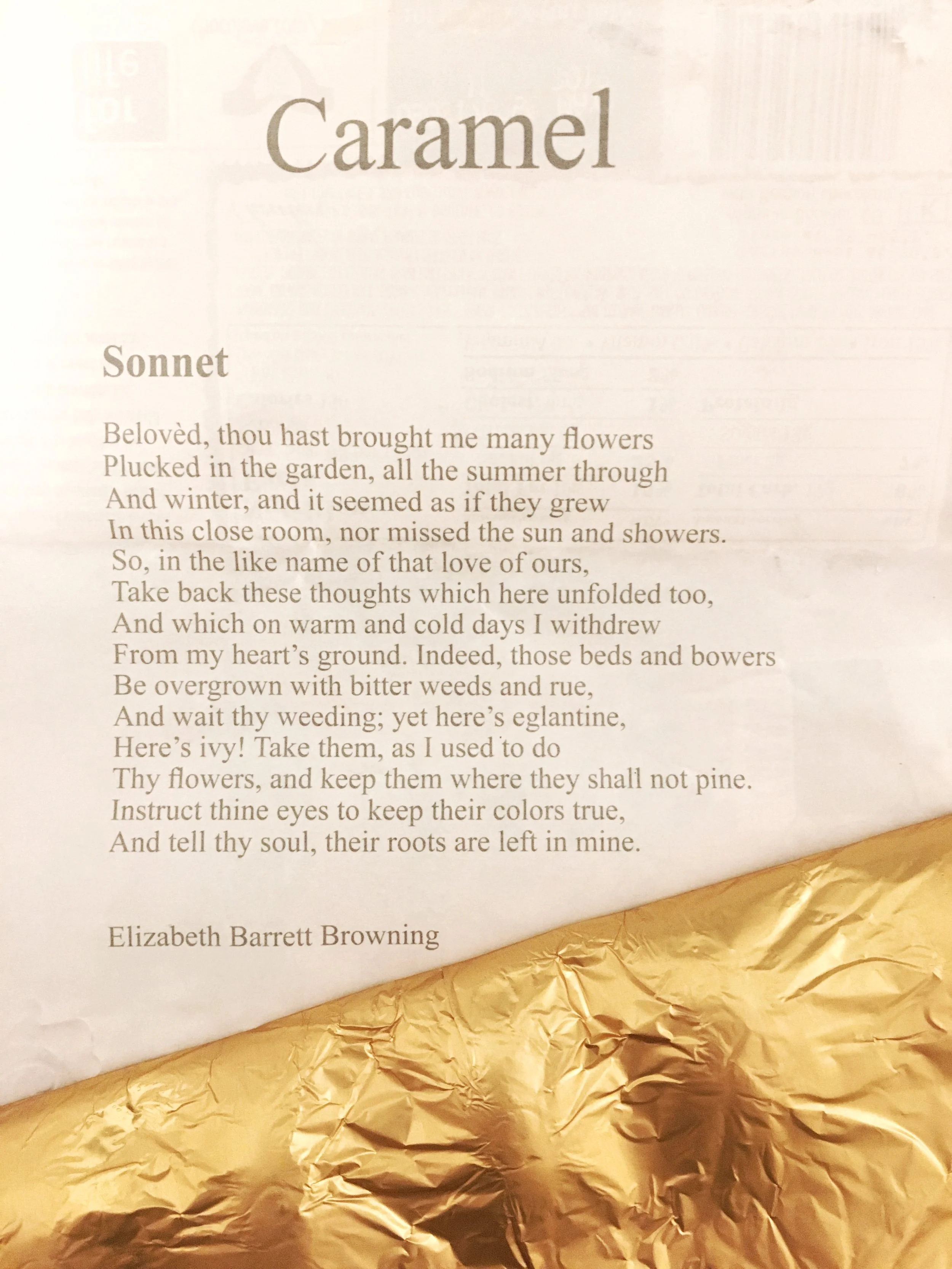

A fun fact about this project is that the poem I used to introduce the story was found in a bar of yummy Salted Carmel Chocolate. Not only was the chocolate a decadent triumph, but the poem inside was a wonderful surprise. The poem captures an era and style of writing that I had been seeking for this project. It embodies all the introspection and emotion that I was unable to put into words and expresses a level of intimacy that I hoped to capture in the final images.

There's always time for an impromptu scarf dance.
PC: Jess Clark
Producer, Photographer, Retoucher: Alicia M. Blair
Styling & Casting: Susana & Alicia Blair
Make-Up & Hair: Jessica Clark
Model: Emily Oceguera Chávez
Thank you for reading!
-AMB
Woohoo! I'm very excited to share my latest shoot with you all. I've been wanting to do this shoot for a few months now, and after a couple of scheduling and model set backs, I finally found a team that was well worth the wait.
Read morePhoto Credit: Unknown
Here we go!
Another before and after of a project I created back in 2013. Take a look and spread the word!
Read moreGetting to shoot footage of a band while they are performing on stage is a total high. As it turns out, 2nd AC can sometimes mean front row seats to awesome gigs. #2ndAClife
Read moreIt was great experience to photograph and speak to the head honchos running the show over at one of the world’s most renowned spirits makers.
Read moreHappy Thursday Everyone!
Don't forget to stop by my blog to check out my latest post on the making of my image "Medici's Muse".
Read moreIn many ways it was difficult for me to watch the film from a technical point of view. All of the stylistic elements were so engaging that it became easy to lose myself in the experience.
Read moreI've never been good at selecting fonts, and these videos are visuals that explain why I struggle.
Typography is so much more than boxy letters or "pretty" cursive. Those might be characteristics of some styles, but to me, they are so much more. The same way colors can mean a million different things, so can typography. Each style has a meaning. It can reflect emotion, time, a place, history, culture, and even the movement of energy. Typography is rich with symbolism, and like everything else in art, it illustrates a type of psychology and/or character.
It's difficult for me to simply pick a font and past it to an image, that seems crude and far too simple. I always like to consider fonts the same way I do all my other work.
-Who are my characters?
-What do they want and need?
-What is their story and why?
Based on my answers I begin to search for fonts. Ultimately it can boil down to, what font best represents my main character?
Watching these two short films illustrates this perfectly. Many people may see a skilled technician and curly lines, but if you look deeper, you'll find a world of information and intention within every pen flick. It's wonderfully addicting to watch.
I feel like my logo is a good start to how I envision my brand as an artist. Simple, elegant, clean, and feminine.

Logo by An Dao.
Alicia M. Blair
Labyrinth of Lies (2014)
This film was both insightful & heartbreaking, and yet aesthetically pleasing to watch. I loved every minute of it!
Read moreA few weeks ago I visited the Stanley Kubrick Exhibit at the Contemporary Jewish Museum in downtown San Francisco. I must confess that I didn’t know much about Kubrick’s work going in, which is why I decided to take this opportunity to finally dig deep into the work and life of this legendary filmmaker. Besides, what better way to learn about someone than by walking through a museum floor dedicated solely to their life’s work?
Read more
Henry (2015) by Ramiro Lopez Dau
I’d like to give a shout out to the six AAU students who helped create this wonderful short VR film titled Henry (2015) by former Pixar animator, Ramiro Lopez Dau. It’s so exciting to know that people from the Academy are working with such talented artists in the motion picture industry.
I wish you all the best on your bright futures and congratulations on your win!
Read moreIf you are visiting San Francisco, or if you live here and haven’t explored Golden Gate Park, I would highly recommend that you do. Whether it’s to stop by the Japanese Tea Garden, Stow Lake (highly recommended), or to explore the gorgeous Conservatory of Flowers, Golden Gate Park is not a place you want to miss. As the Nike motto goes, “Just do it!”
Read more